auto-resize-custom-select # 

Auto-resize the width of a
selectelement based on the size of the current selectedoption.
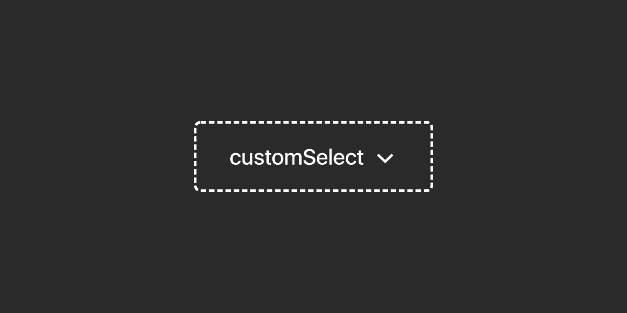
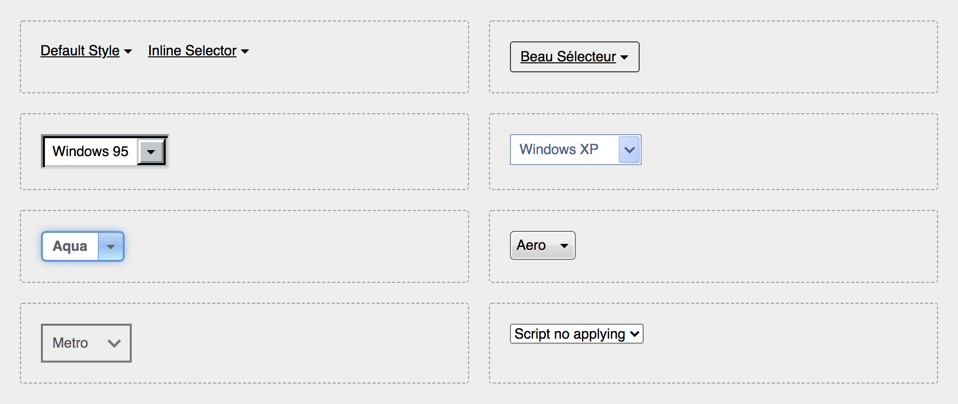
Fully customizable with CSS without the common styling limitations of aselectelement.
customSelect. Auto resizes drop-down select html elements to fit the size of the option that has been selected. It also gives you total freedom and control to style the list selector with CSS without the usual constraints on this form elements.
It creates a substitute span element with the .custom-select class, which contains two children span elements, with the selection value (.selection) and the expand figure (.arrow) that you can stylize as you wish.
<!-- Generated markup from the <select/> element -->
<span class="custom-select">
    <span class="selection">value</span>
    <span class="arrow">[::after]</span>
</span>
Install
$ npm i auto-resize-custom-select
Easiest way to install it is via NPM or including the minified file from the unpkg or jsdelivr CDNs.
<script src="https://unpkg.com/auto-resize-custom-select"></script>
<script src="https://cdn.jsdelivr.net/gh/alterebro/auto-resize-custom-select/dist/customSelect.min.js"></script>
Examples
Some examples can be seen on this CodePen: https://codepen.io/alterebro/full/RwopMYp
Usage
Just include it on your document and call the customSelect function. The script is available as ES5 minified file and as ES Module.
    ...
    <select>
        <option value="1">un</option>
        <option value="2">deux</option>
        <option value="3">trois</option>
    </select>
    ...
    <script src="https://unpkg.com/auto-resize-custom-select"></script>
    <script>
        customSelect();
    </script>
</body>
</html>
import customSelect from 'auto-resize-custom-select';

customSelect();
Options
You can set some options by passing an object as parameter to overwrite the default values:
customSelect({
    el: 'select',
    className: 'custom-select',
    expandChar: '\u25BE',
    width: false,
    injectCSS : true
});
el
A css selector that'll pick the elements you want to be affected by the script. It defaults to select in order to take all the <select> elements.
className
Name of the class that will adopt the substitute parent element. Its default name is custom-select. The element tree to style then result as follows:
.custom-select {} /* Container Element */
.custom-select .selection {} /* span containing the selected option */
.custom-select .arrow {} /* span containing the expand element (arrow) */
.custom-select .arrow:after {} /* - it's created using the :after pseudo-element */
expandChar
The expand character created via content in the :after pseudo-element. The default value is the CSS ISO Code \u25BE ( Black down-pointing small triangle )
width
When set to false (default) it will resize itself to the width of the selected option. When set to a valid css dimension value, it will have a fixed size.
injectCSS
The script injects by default some CSS styles at the top of the head of your document in order to create a minimum acceptable design for the generated code. If you don't need it and you want to style it your way, this can be disabled by setting this property to false
/* Default injected CSS code: */
.custom-select {
    position: relative;
    display: inline-flex;
    align-items: center;
}
.custom-select .selection {
    text-decoration: underline;
    flex: 1 1 auto;
}
.custom-select .arrow:after {
    content: '\u00a0\u25BE'; /* No-break Space + Expand Char */
}
.custom-select select {
    all: revert;
    position: absolute;
    cursor: pointer;
    opacity: 0;
}
Development
# Source: /src/customSelect.js

# Clone the repo
$ git clone https://github.com/alterebro/auto-resize-custom-select.git
$ cd auto-resize-custom-select/

# Install dependencies
$ npm install

# Build (/dist)
$ npm run build

# Build (/docs: https://alterebro.github.io/auto-resize-custom-select/)
$ npm run docs
License
MIT © Jorge Moreno. @alterebro


